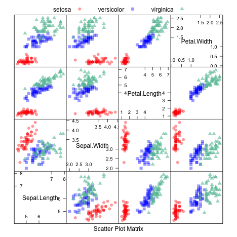
The featurePlot function is a wrapper for different lattice plots to visualize the data. For example, the following figures show the default plot for continuous outcomes generated using the featurePlot function.
For classification data sets, the iris data are used for illustration.
str(iris)
'data.frame':	150 obs. of  5 variables:
 $ Sepal.Length: num  5.1 4.9 4.7 4.6 5 5.4 4.6 5 4.4 4.9 ...
 $ Sepal.Width : num  3.5 3 3.2 3.1 3.6 3.9 3.4 3.4 2.9 3.1 ...
 $ Petal.Length: num  1.4 1.4 1.3 1.5 1.4 1.7 1.4 1.5 1.4 1.5 ...
 $ Petal.Width : num  0.2 0.2 0.2 0.2 0.2 0.4 0.3 0.2 0.2 0.1 ...
 $ Species     : Factor w/ 3 levels "setosa","versicolor",..: 1 1 1 1 1 1 1 1 1 1 ...
Scatterplot Matrix
library(AppliedPredictiveModeling)
transparentTheme(trans = .4)
library(caret)
featurePlot(x = iris[, 1:4],
            y = iris$Species,
            plot = "pairs",
            ## Add a key at the top
            auto.key = list(columns = 3))
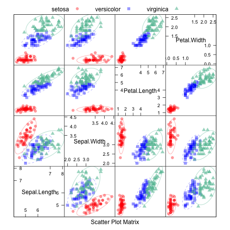
Scatterplot Matrix with Ellipses
featurePlot(x = iris[, 1:4],
            y = iris$Species,
            plot = "ellipse",
            ## Add a key at the top
            auto.key = list(columns = 3))
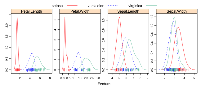
Overlayed Density Plots
transparentTheme(trans = .9)
featurePlot(x = iris[, 1:4],
                  y = iris$Species,
                  plot = "density",
                  ## Pass in options to xyplot() to
                  ## make it prettier
                  scales = list(x = list(relation="free"),
                                y = list(relation="free")),
                  adjust = 1.5,
                  pch = "|",
                  layout = c(4, 1),
                  auto.key = list(columns = 3))
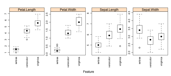
Box Plots
featurePlot(x = iris[, 1:4],
                  y = iris$Species,
                  plot = "box",
                  ## Pass in options to bwplot()
                  scales = list(y = list(relation="free"),
                                x = list(rot = 90)),
                  layout = c(4,1 ),
                  auto.key = list(columns = 2))
Scatter Plots
For regression, the Boston Housing data is used:
library(mlbench)
data(BostonHousing)
regVar <- c("age", "lstat", "tax")
str(BostonHousing[, regVar])
'data.frame':	506 obs. of  3 variables:
 $ age  : num  65.2 78.9 61.1 45.8 54.2 58.7 66.6 96.1 100 85.9 ...
 $ lstat: num  4.98 9.14 4.03 2.94 5.33 ...
 $ tax  : num  296 242 242 222 222 222 311 311 311 311 ...
When the predictors are continuous, featurePlot can be used to create scatter plots of each of the predictors with the outcome. For example:
theme1 <- trellis.par.get()
theme1$plot.symbol$col = rgb(.2, .2, .2, .4)
theme1$plot.symbol$pch = 16
theme1$plot.line$col = rgb(1, 0, 0, .7)
theme1$plot.line$lwd <- 2
trellis.par.set(theme1)
featurePlot(x = BostonHousing[, regVar],
            y = BostonHousing$medv,
            plot = "scatter",
            layout = c(3, 1))
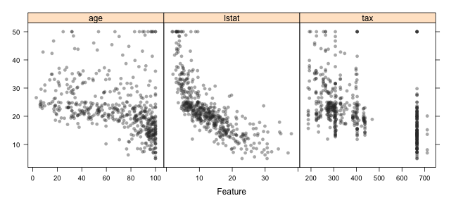
Note that the x-axis scales are different. The function automatically uses scales = list(y = list(relation = "free")) so you don't have to add it. We can also pass in options to the lattice function xyplot. For example, we can add a scatter plot smoother by passing in new options:
featurePlot(x = BostonHousing[, regVar],
            y = BostonHousing$medv,
            plot = "scatter",
            type = c("p", "smooth"),
            span = .5,
            layout = c(3, 1))
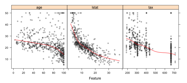
The options degree and span control the smoothness of the smoother.